Final product - Print work


Designing of my Magazine Advert

I began by creating a blank A4 document


I included the HMV dog logo because I was creating an advert for a magazine which would feature a HMW advert and created the grey background for my text to go in


I included images of what was being sold in this specific advert and included prices


Included all the text including the HMV logo's and legal information, as well as a description of the items being sold


I finally included the HMV logo's of how to purchase the items being sold, again to follow conventions of a HMV advert

Designing of the Inset of my Album cover

I began by creating a blank document 30cm x 12.5 cm. This was because I combined both side in one as opposed to doing two seperate sides.


I divided the blank document up with what would be the inside of the spine if the case was to be opened


I used a photograph I took of the inside of a Jewel CD case and created where the CD would go


I included a photograph taken at the beach of the band using natural surroundings and light, again desaturated it to incorporate the style used throughout the album


Adding in the font style which appears on the front cover

Designing of my Back Cover

I started with a photograph I took of the church we were going to include in our video


Like the front cover, I desaturated the image


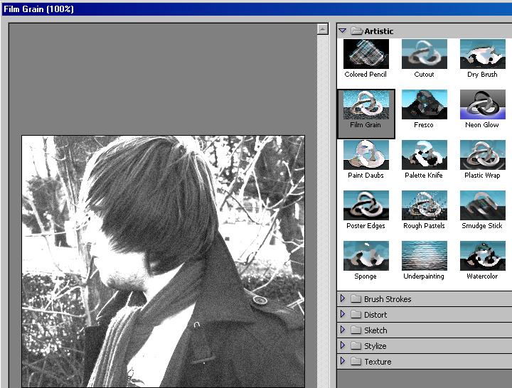
Once again I used Filter > Artistic > Film Grain to follow the style used on the front cover


I then added the text using "Papyrus" again to retain a similar style created on the front cover


I added the legal information such as copyright info. and who owns the rights to the music and video


Finally I added the owners logos and barcode

Designing of my Front cover

I began with a photograph I took of Warren in a natural surrounding using natural light


I desaturated the image to dispatch of all colour


I then used Filter > Artistic > Film Grain to give the image a grainy look which will follow the convention of the "grungy" style


After inserting the text using the font "Appendix3" I created a shadow using an Outer Glow in black


I did the same for the "In the Middle" title using "Papyrus" font style

Flat Plans

I then decided to draw up some basic flat plans on what I wanted my front cover, back cover, inset and spine to look like.


Analysis of Album Artwork


Before progressing onto my print work I looked at artwork from various albums. From looking at these albums from a variety of bands I can see that there are conventional styles used throughout. All album covers use the same "grungey" background with an image of the band/band member. The use of the background is to suggest what type of music it is. You automatically associate rock music with dirtiness and grunge. This is reinforced with the use of the similar font styles on the Theory of a deadman and the Nickleback albums. As for the Hinder album it shows the band wearing sunglasses with a more "fashionable" font, it looks slick and suggests that this band isnt grungey, however, the mise en scene of the cover suggest otherwise. One of the band members is wearing ripped jeans and they are all posed in a stance which suggests they are very independant people. This contrasts with the font style but this is the only example I could find of where this occurs.

Despite the previous facts the main conventions still include a simple background, with an image of the band/band member and a font style which suits the genre of music. I will be following these conventions as i believe it will appeal to my target audience more.